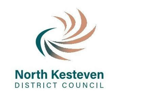
North Kesteven District Council to consider rebranding with new corporate logo


It is anticipated that related costs to implementing the new branding strategy will amount to around £5,000 and could take up to three years to completely roll out to minimise spending and wastage.
The current logo, an orange sun/flower has been in use in North Kesteven for 12 years since it ditched its coat of arms from branding.
Advertisement
Hide AdAdvertisement
Hide AdOfficers have been seeking to “re-vision” and “evolve” it into something which more characterises the flourishing, dynamic and vibrant characteristics of the council’s approach to the community and promotes their revised vision and plan for the district.


The new logo is proposed to build on the strengths of the existing one with a more contemporary style and shape, incorporating deep orange (to add more uniformity than the current varying shades of orange which can be hard to reproduce) and dark green, to be easily read across all formats. It would also result in lower printing costs.
The preferred design, referred to as the ‘Flourish’, takes its inspiration directly from the petal whorl of the out-going flower-like logo and is said to be rooted in the physical, economic and emotional landscape of North Kesteven, broken down to continue a circular theme but with added dynamism.
It nods to aviation, engineering and agriculture, all aspects of the district, strengthening corporate identity.
Advertisement
Hide AdAdvertisement
Hide AdA report to the executive board on March 27 by Corporate Director Phil Roberts and Communications and Media Manager Jason Hippisley was recommended to full council meeting to be held on Thursday, April 26. They state that the old phrase ‘districtNK’ is confusing, lacks credibility and meaning and doesn’t communicate who the authority is. Nor does the current brand stand out alongside partner logos.


It is variously known as the blip, the star, or the flower and its orange, black and white colour scheme are viewed as stark and dated.
They want to reflect a change to the council’s vision from the long-held ‘100 Flourishing Communities’ to the more inclusive ‘A District of Flourishing Communities’.
The council’s in-house graphic designer was tasked with refreshing the branding through “limited, low-cost intervention rather than wholesale, expensive change”. Continued use of orange as a core colour ensures existing materials can still be used up over time, avoiding greater expenditure but it can also be printed in black and white.
Advertisement
Hide AdAdvertisement
Hide AdDistrictNK would be removed, replaced by the full ‘North Kesteven District Council’ to clearly reinforce its status.
Adoption of the new design, which would still require fine tuning, would take effect following the Annual Council Meeting in May. If given the go ahead, high profile positions including main reception signage, customer services, website, social media accounts, email signatures and so on would be first to change, while letterheads, agendas and documents would be amended for future use.
The rest of materials, signs and clothing would be relabelled and adapted as cheaply as possible as and when things need to be replaced.
“While the bulk of the transition should be complete within 12 months, in reality, it may take a good three years to full role out comprehensively,” says the report.